What is responsive design?
Responsive design means writing code ONCE, and having the page look great EVERYWHERE. A great, responsive site should be able to adapt to various screen resolutions. It will look good on a desktop computer, iPhone, iPad, or any of the other devices that people carry around in their pockets. There are four types of responsive design: responsive, adaptive, fluid, and fixed. Each of them fall under the broader category of being “responsive,” yet each has it’s own pros and cons.
How to tell is a website is responsive?
One way to test if your site or any site is responsive is just by opening it up in the browser and then doing this, making it smaller. This way you can see if the website looks good at the various widths and sizes.
Responsive Design Examples
Here’s an easy way to start learning responsive design:
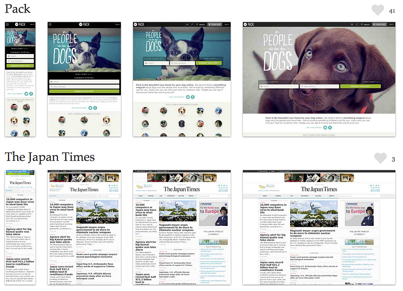
- Look at the images of Pack below. What is the difference between the smallest screenshot (on the left) and all of the other screenshots? Write down at least 3 differences that you see.
- After writing down the differences you will quickly see what it means for a site to be “responsive”. After you complete Pack, do the same for The Japanese Times. More examples can be found at http://mediaqueri.es/. (5 minutes).
What language do you use to make a site responsive?
The one language that really makes responsive happen is CSS. It’s a combination of HTML and CSS. If you’re looking to learn responsive design, google and learn about “media queries” specifically.
What’s a media query?
“Media Query” is the official CSS property largely responsible for making a site responsive. If you’re already a developer, try adding this CSS into your stylesheet. See what happens!
@media (min-width: 400px) and (max-width: 600px) {
    h1,h2,h3,p {
        color: red !important;
    }
}
The code listed above should make your h1, h2, h3, and p tags (headers and paragraphs) red. You can play around with some example code over at Google’s page on media queries.
Can you add responsive design to an existing site?
You could always add responsive later on but it’s going to be a lot more effective to do it in the beginning. And luckily, there’s some great frameworks, or really ‘free’ code out there, that you can use, or your developers can use for free. The most famous front-end framework is Bootstrap. It’s basically like free code that you can use to build your site on top of, and it gets you about 80 percent of the responsiveness just right out of the box. It’s awesome.
Additional Resources to Keep You Learning
- Responsive vs. Adaptive vs. Fluid Design: an in depth exploration of learning responsive, adaptive and fluid CSS web development.
- Bootstrap: a popular framework for making a responsive website. Download it for free.
- Learn Responsive Design — An online course where you can learn the fundamentals of responsive design.